

 ARTIST'S
IMPRESSION

CHARLOTTE WILSON TELLS US HER VISION OF SEAMLESS INTERIORS AND BESPOKE JOINERY.
What inspired the design?
Structurally, we took a tectonic architectural approach. Not unlike the passion fruit with its hard, punched rind and soft, luxurious centre, the idea was to juxtapose the playful textures of a precast concrete exterior with a beautifully sumptuous interior. Environmentally, the building responds to the context of Alexandria’s light industrial heritage retaining a sense of space and volume in keeping with the warehouse it replaced.
How did you arrive at the materials and colour scheme?
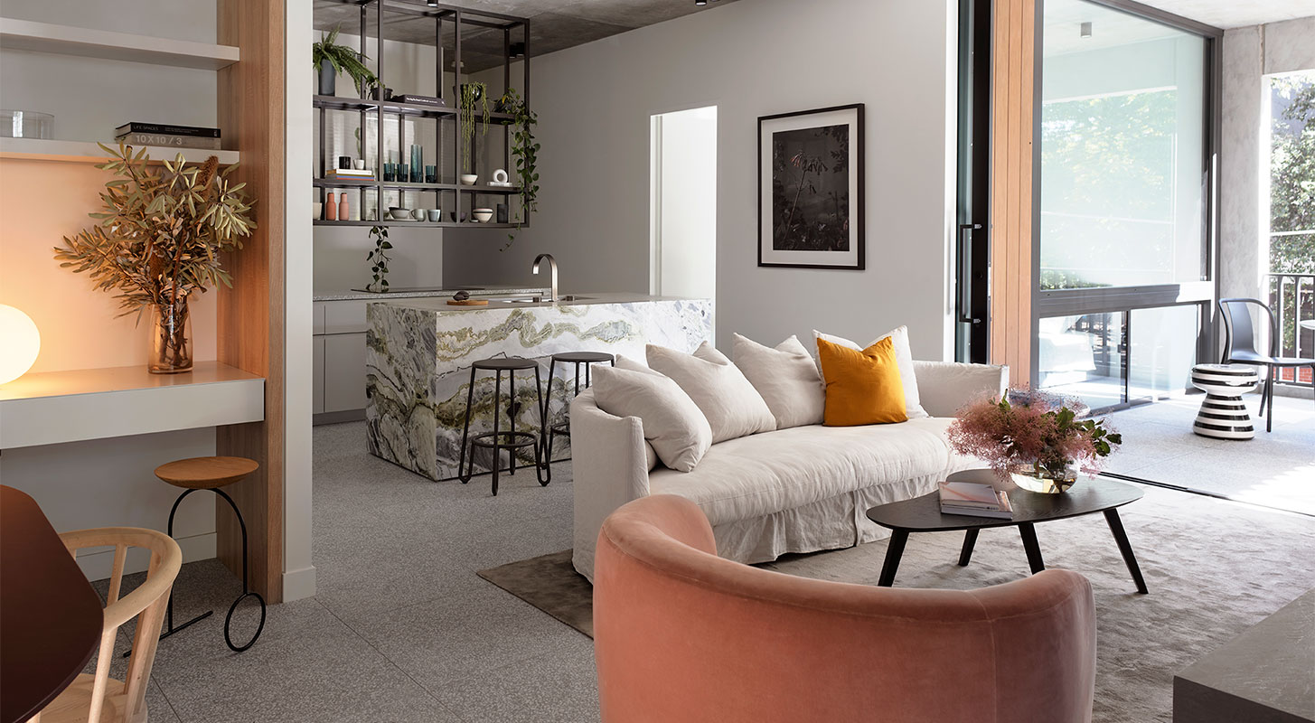
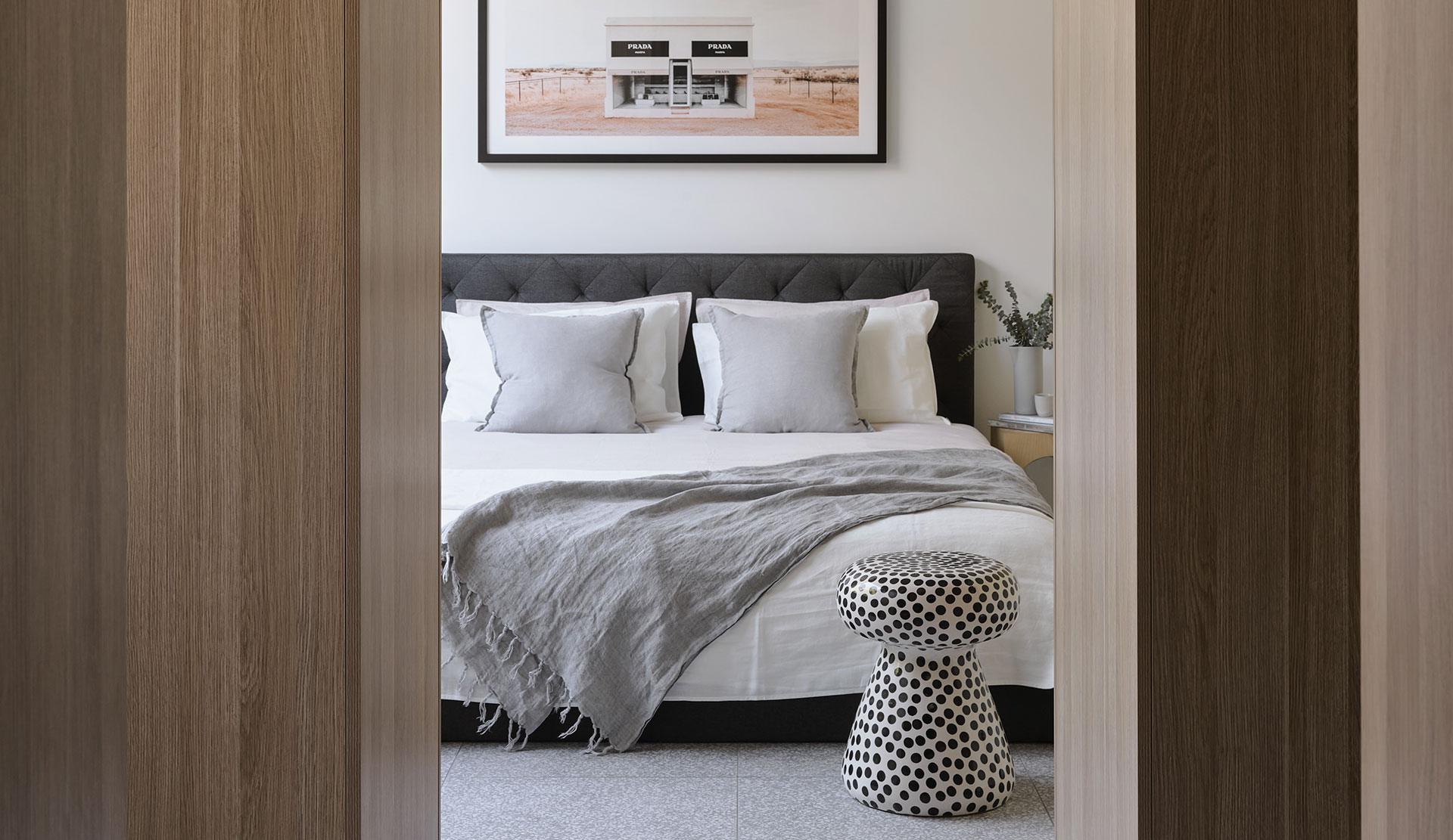
A balanced contrast between materials is key, which in turn informs a timeless and minimalist colour palette. The fluted concrete of the exterior continues inside the building and is offset by the natural timber framework. The warm tones of the interiors are accentuated by terrazzo, rich marble and iron-bronze tactile detailing which complement the cooler tones of the concrete shell.
We viewed nature, too, as one of our materials the palette is draped with the backdrop of natural greenery that furnishes the internal and external courtyards.
How did you arrive at the materials and colour scheme?
A balanced contrast between materials is key, which in turn informs a time- less and minimalist colour palette. The fluted concrete of the exterior contin- ues inside the building and is offset by the natural timber framework. The warm tones of the interiors are accentuated by terrazzo, rich marble and iron-bronze tactile detailing which complement the cooler tones of the concrete shell.
We viewed nature, too, as one of our materials – the palette is draped with the backdrop of natural greenery that furnishes the internal and external courtyards.
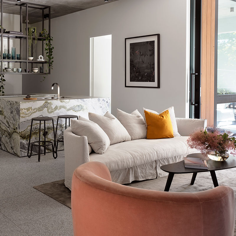
BOLD, MASCULINE INTERIORS DOMINATE THE HIGH- CEILINGED LIVING SPACES — AT ONCE COMMANDING AND INTIMATE — WITH INTERNAL COURTYARDS AFFORDING VISTAS FROM EACH RESIDENCE INTO COMMUNAL GARDEN AREAS.
What excites you the most about Clarion?
It’s incredibly bespoke. Every residence is crafted with the level of luxuriant detail you’d normally find in a single home let alone 18 residences. No detail has been spared. Every home has the attributes of a penthouse. The way the interiors connect to the exterior is special too: we’ve taken the simplicity of the facade and brought it through to the inside so they share a close relationship. The high concrete ceilings, together with lightgrey terrazzo flooring and warm timber, continue the hard but soft timeless quality that pervades the whole building.
There’s also a seamless, ever present connection to nature. We’ve curated the views, so that wherever you stand there’s a window or opening looking onto a shared green courtyard or the trees outside. And yet, you still have your privacy. It’s really a quite unique balance we’ve struck.
We’re also excited about the bridging element that joins the two buildings as it houses a commons area that raises the bar for amenities in an apartment complex. Offering a shared retreat where you can relax and recharge with library room, sauna, gym, lap pool and outdoor area forming a social hub, this space is very much at the heart of the scheme and what elevates Clarion from a home to total lifestyle.
How do you hope people will talk about it?
Our tenants will never use the word ‘unit’ or ‘apartment’ simply because their home won’t feel like that. Each residence looks and feels like a house complete with cosy fireplace, a sense of privacy and intimacy, as well as landscaping, street level parking, and neighbours you interact with.
As for passers by, they probably won’t even notice it, that’s how naturally it fits into its context. So if they say nothing at all, we’ve done our jobs.

 ARTIST'S
IMPRESSION